Gators, Golf Balls and Intuition

During a conversation last week, a friend of mine asked if I’ve read Daniel Kahneman’s book, “Thinking Fast and Slow,” which explores the process of thinking. This raises the age-old debate of whether to rely on intuition in making a decision or invest in further study and analysis. As a numbers-guy, I enjoy and often lean toward the latter, but this isn’t a one size-fits-all choice – both approaches have their place. What’s most interesting to me is how often we take the simpler, quicker route of following our instincts, without even pausing to consider the basis of our instincts.

Personal case-in-point: last weekend I was playing golf in Florida. On the sixteenth hole I pushed my tee shot off to the right. A push, not a slice! My ball came to rest in a sandy area between the fairway and a small pond. As I walked toward it, contemplating club selection, I heard a steady, low hissing sound off to my right. Woah!!! Yep, there lay a gator, perhaps six or seven feet in length, lying still in the sand, maybe ten feet or so from my ball. I kept on walking. And the gator, he just kept sunning himself. Never even budged.

Fast forward a few days to a conversation I was having with another friend recounting my trip. Of course, the gator story came up. “Ah, the gators aren’t a problem,” I said. “They’re used to us. They’ll hiss at you, but as long as you don’t bother them, they won’t bother you.” I wasn’t trying to sound tough, I was honestly just sharing what I believed.

What I believed. Beliefs. The drivers of intuition.

And in this case, my beliefs were based on…., what? A recent, personal experience. A sample size of one. One gator. One hiss. One casual stroll by. No issues.

But what if it had been a different gator? Or even the same gator, but at a different time of day? Or what if I’d gone three steps closer to him? Or it had been a mother with babies nearby? Or what if….?

Our strongest beliefs come from personal experience. And the stronger the belief, the less we feel the need for further thought or study. That’s instinct. It won’t change. So be it. But it’s helpful every now and again to reflect on our beliefs and challenge them. To put them in their proper perspective. To revisit their basis. This makes for better intuition, and thus decision making, when our minds go that route, voluntarily or not.

Posted in Problem Solving | Leave a comment

Skills analysis?

As the volume and availability of data continue to expand while their costs decrease, so do companies continue to seek to use this growing body of information to their advantage. Assessing the skill sets of potential hires is one area where they are doing so successfully, according to a recent Wall Street Journal article.

While I proudly describe myself as a “data guy” and make my living in large part on helping companies and individuals strengthen and apply their analytical skills, I also think it’s important to be realistic regarding the limitations of our analysis. Said simply, you can’t measure everything.

The Journal article noted one company measuring “friendliness, curiosity and the ability to multi-task.” It’s the second of these attributes that caught my attention. Curiosity is one of four characteristics I consider essential to analytical success – creativity, critical thinking and courage being the others – and one I’ve often thought about regarding various means of measurement.

The complication comes in that curiosity, at its very core, is a proactive characteristic. It is initiated naturally by the mind, not by a multiple-choice question on a standardized test. It occurs spontaneously on its own terms, not on command during some interview. It is evident when it is evident, which may or may not be during the course of an assessment.

So, while I applaud the effort to measure curiosity, I’m highly skeptical about the ability to do so with any real accuracy.

That doesn’t mean we shouldn’t continue to try, only that we be honest in the limits of our analytical methods, and continuously seek to improve them. Just as any great Problem Solver would.

Posted in Problem Solving | Leave a comment

Cool charts? Says who?

A number of years ago I attended a day-long seminar on information design provided by the renowned expert, Edward Tufte.

While I admire and have great respect for his work, I took exception to a couple of his comments.

“There is no such thing as information overload, only bad design,” Tufte said at one point. And later he advised us to “always strive to build a super chart.” A super chart, in Tufte’s vernacular, is a chart with high information density, allowing the viewer to absorb more information in a single display.

While there is some good in this guidance – it forces us to think, to exercise our creativity, and to evaluate our data on multiple dimensions – it also contains a fatal flaw: it implies the writer/designer is more important than the audience. “I don’t care if you have to squint, twist your head sideways, and stare at this for five minutes, for I have constructed a beautiful super chart!!!”

I think the better guidance is this: Make every design decision with one purpose in mind: helping the audience understand your message as clearly and quickly as possible.

Now, this advice isn’t necessarily at odds with Tufte’s (I know what I would do if I was preparing a presentation for him), but often times our presentation output hinders audience comprehension. It makes them work. It makes it more difficult for them to make the very comparisons we intend.

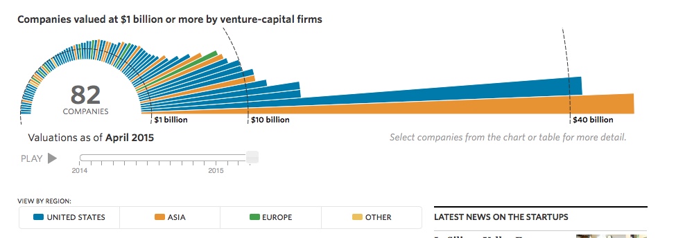
As an example, consider the following graphic from the Wall Street Journal, showing startup companies valued over $1B.

What do they want us to take away from this?

In short order, I recognize there are 82 companies over $1B in value, dominated by a couple of large ones, and that most of the companies are based in the U.S. (taking a quick glance at the color key). But I don’t know the identity of any of them. And I certainly can’t compare the valuations very well, due to the circular axis and the large scale (since most companies are on the small end). Wouldn’t a simple bar graph be easier for the audience to digest?

The actual graphic on the Journal’s website is dynamic in nature, showing how the number of companies has roughly doubled and their valuations grown over the past two years. It’s certainly “cool,” I imagine Tufte (and the Fonz) would approve, but is that ever really our goal in visual design? If so, I’d suggest our underlying message needs work.

Work on the impressiveness of the message, and keep the visual design simple. Remember, it’s all about the audience.

Posted in Presentations | Leave a comment

What’s your analytical composition?

Gene Zelazny, the former McKinsey communications specialist, in his book Say It With Charts, claims that in our analysis we are really making only one of five types of comparisons:

1. Time Series: How a variable changes with time
2. Rank: How a variable compares in size to others
3. Component: How a variable breaks down into its subcomponents
4. Frequency: How common are different values for a particular variable
5. Correlation: How a variable changes with changes in some other variable

When I first read this long ago, it seemed too simple. But if you scrutinize the charts you create and encounter, and attempt to describe the underlying analyses using these five comparisons, I think you’ll find Zelazny’s framework by and large works.

And if so, I believe that leads to two very important questions:
1. How valuable is each of the five comparisons, relative to the others?
2. And how commonly do we use each of them?

The answer to the first question, of course, will vary given the problem under consideration, but generally speaking, I believe a strong case can be made that Correlation is most important. And by a pretty fair margin.

Why?

Because the first four comparisons only explain what is happening with a particular variable, while correlation seeks to describe why it is happening. And isn’t this really our goal in analyzing a situation? To understand why things are as they are, so we can adjust and make things better?

And if you share this view of Correlation, you might assume in answering our second question that it is the most commonly performed comparison.

But is it?

Again, the precise answer will vary depending on the situation, but in general, I believe correlation is actually the least common of our five comparisons. In scanning last week’s Wall Street Journal not a single scatter plot (the most popular chart type used in displaying a Correlation comparison) could be found. Not one. 68% of the charts depicted Time series comparisons, 16% Rank, 15% Component and 1% Frequency. Again, not a single Correlation.

How would these numbers change in the accounting of your analytical work?

I think it’s safe to say, we’d all be better off with a few more Correlation comparisons in the mix.

Posted in Problem Solving | Leave a comment

Poor writing leads to war!

The importance of brevity and clarity in our presentations can’t be overstated.

On July 25, 1918, Serbia responded to a set of ten demands from Austria-Hungary stemming from the assassination of the Arch Duke Franz Ferdinand. As G.J. Meyer writes in A World Undone, Serbia’s response was not defiant, but actually “conciliatory, respectful, and at times submissive in tone,” the type of response that very well should have served to de-escalate the tensions mounting across Europe.

But according to Meyer the response “was also long, and its language was artfully oblique.” Meyer concludes “as positive as it was in many ways…the response can fairly be regarded as one of the mistakes that led to war.” World War I began shortly thereafter.

In the interest of peace, in your presentations, please be clear and concise!!

Posted in Presentations | Leave a comment

The laborious (and valuable) task of data preparation

In my last two analytical posts (the past two Mondays), I emphasized the challenges inherent in designing the analyses necessary to prove or disprove our ideas. My overarching point was that rarely does data and analysis align perfectly in a single convincing proof, and that as a result, we need to be creative and resourceful in designing multiple analyses which, when taken together, provide sufficient insight to claim some idea, explanation, or path forward as wise and sound. This is essential to great analytical work, and easier said than done.

In “Scorecasting,” an entertaining book that critically explores a number of sports axioms, I recently came across a great example of another valuable element of the analytical process: adding our own unique categorization to the data we collect.

In “Scorecasting,” the authors set out to quantify the value of a blocked shot in basketball. This led to a better question: Are all blocked shots equal in value? To answer this, they created their own categorization of blocked shots: a block of a shot that was unlikely to have been made, a block of a shot that was very likely to have been made, a block of a shot tipped directly to a teammate that started a fast break the other way, and so on. This categorization was essential to accurately value each blocked shot. There was only one problem: nowhere did this data exist.

How many times do we come across this problem? Gee, I’d love to know how aggressive our sales team was on each sales call last month. And, I’d sure like to know the educational level of each of our customers. And experience level. And wouldn’t it be great to know how much higher of a price each customer would have actually been willing to pay?

If only that data existed. But it doesn’t.

And some times that’s the end of story. The data truly doesn’t exist.

But other times, the data actually does exist – or some reasonable approximation of it – only we choose not to put forth the thought and effort to obtain it. Yes, we might have to review and assign each and every record to a particular category. And yes, we might have to first perform some additional research, or conduct a long series of interviews, before classifying our data. And yes, all this can be incredibly labor intensive. But it is possible. The data actually does exist.

In “Scorecasting,” the authors viewed seven years of video to categorize every blocked shot into the classifications they established. Without question, that took a lot of time! But it also enabled them to better value the true impact of each player’s shot blocking. Information that might be very useful in coaching shot blocking techniques, or in negotiating a player’s next contract.

Collecting, cleaning, categorizing and otherwise preparing data often requires large amounts of creativity, resourcefulness and time. That’s why very few people do it well. And why those that do, stand out.

Posted in Problem Solving | Leave a comment

Charts: Sticking to the basics

I appreciate elegant design. And I enjoy trying something new. But when it comes to the construction of charts, sticking to basics is almost always the right answer. And for that, I always turn to Gene Zelazny’s classic book, “Say It With Charts.”

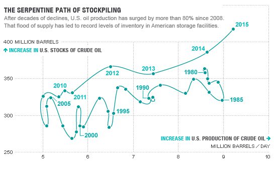
In a recent article in Fortune magazine, I found the following chart depicting U.S. Crude Oil Daily Production and U.S. Crude Inventory over the past thirty five years.

Interesting.

So, what do we make of this? Generally speaking, I can see that daily output dropped up until about 2008 before rising and slightly exceeding the level of 1980. Crude oil inventory was fairly volatile until 2008 and then began a steady rise. Yes, I can see it, but it takes a little mental processing and tracing my finger along the points and axes.

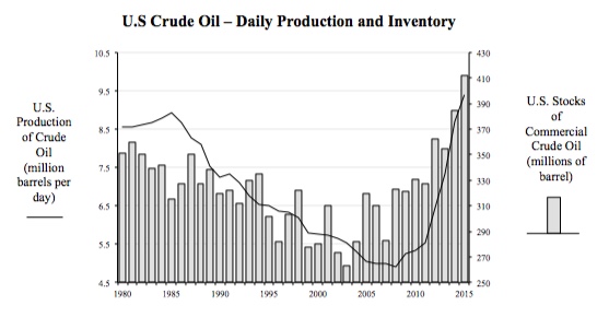
What if we just used two simpler time series charts per Zelazny’s guidance? If we did, we’d wind up with the following.

Better? It’s not as unique as the first chart, without the fancy squiggly line and all, but I can definitely see the trends, the variability and the correlation in the data all better in this version. So, yes, it’s better.

It’s always good to evaluate our options for displaying data, but we should never allow ourselves to put fanciful design ahead of the true purpose of any chart: to help the viewer make the intended comparison as quickly and as clearly as possible, with zero distortion of the data. Sticking to Zelazny’s basics will always serve you well.

Posted in Presentations | Leave a comment

Analytical proofs (Part II)

In my last post I claimed that defining the analyses required to prove or disprove an idea is often far more difficult than it might first appear. As food-for-thought, I then suggested you consider how to test the idea that a baseball player’s performance suffers as his weight increases. It later occurred to me that most readers might only have had a moment to do this, and thus never really recognized the difficulties inherent in defining a sound analysis, the very point I was trying to make. So, I thought I’d use this post to share a few thoughts and better illustrate last week’s message.

So, baseball performance as a function of player weight, what to do?

I always like to start by picturing the resulting output. Two charts come immediately to mind.

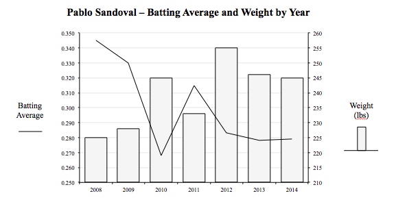
The first would compare the performance of a particular player (Pablo Sandoval, in last week’s example) as a function of his weight throughout his career, as illustrated here.

While this chart is a helpful start in evaluating the performance vs. weight argument, it leads to more issues than answers. Specifically:
• We have a very small sample size (7 years)
• There are many other factors (e.g., player age) that may be determine performance
• Player performance is not easily defined by a single measure. Here, I use Batting Average, but why not Home Runs? Fielding Percentage? OPS (On Base % Plus Slugging %)? Or WAR (Wins Above Replacement level)?
• Player weight data is very unreliable (it is often over or under stated and may change significantly during the season).

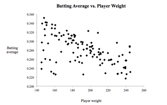
A second analysis we might perform is to examine performance as a function of player weight for a large set of players, as in the scatter plot below.

This analysis solves our earlier sample size issue, and we could choose to filter our data to include only players of equal age to better isolate the relationship between performance and weight. But it still leaves us wrestling with the best measure of player performance. And it actually introduces another complication with weight: since our analysis now includes multiple players, we have to recognize that not all pounds are equal. Two players of equal weight may have gotten there by entirely different means, one by spending time in the gym, the other by spending time at the dinner table.

I could continue, but the point of this post is not to arrive at the best analysis of player performance vs. player weight, but rather to illustrate that most of the analysis we perform is far trickier than it might initially appear.

Our response should not be to take the easiest short cut, or to give up in frustration, but instead to recognize the limits of each source of data we use and each analysis we perform, and to strengthen our overall argument by basing it on a set of analyses that explore an issue from multiple perspectives.

Posted in Uncategorized | Leave a comment

“Prove it!”

This is the default mindset of the analytically oriented. Their beliefs are based on facts and calculations, not instincts and assumptions. They are suspicious and skeptical, in a healthy sort of way. They demand a higher burden of proof.

The critical question that emerges then is: How do I prove it? What facts can we collect, what analysis can we perform, what experiments can we conduct that, taken together, sufficiently substantiate our belief?

This “designing of proofs” is an incredibly important task in our analytical work, requiring creativity, logic and critical reasoning. It is also far more difficult than most would imagine. Many aren’t willing to invest the time and thought and simply say, “it’s obvious.” Others go to the opposite extreme, drowning their doubters in data, most of which is irrelevant. Neither approach is effective.

All this came to mind recently while reading “Sons of Sam Horn,” a Boston Red Sox web board. Many of the contributors to the board were deeply concerned over the physical condition (or lack thereof) of Pablo Sandoval, based on the picture below, who the Red Sox recently signed to a five year, $90 million contract to play third base.

“He’s out of shape! He’s going to have a horrible year!! What a terrible waste of money,” cried many. Their underlying belief: A player’s performance is negatively correlated with his weight.

A contrarian group came back with a simple request. “Prove it!!”

How would you?

Posted in Problem Solving, Uncategorized | Leave a comment

Horrible Bosses

No, not the movie, but the real world kind.

“I hate my boss,” my son, a teenager working at a local fast-food restaurant, recently said to me. “He ‘s condescending. And he rides me for every mistake, even the smallest ones.”

Welcome to the working world, kid! Get used to it!!

(I feel safe in sharing this as it’s HIGHLY unlikely that either my son or his boss read this blog!)

With all kidding and sarcasm aside, surely not all bosses are bad. So, what makes a boss good? It’s an important question, one I think about often in my efforts to help companies develop analytical skills.

The answer isn’t simple, and varies depending on a company’s goals, competitive position and personnel. But some characteristics prove universal. A number of these were evident in a recent Wall Street Journal article describing a meeting led by Ashton Carter, the new Secretary of Defense, evaluating our country’s approach to combatting ISIS in the Middle East. Here are a few quotes from the article:

• “For 90 minutes, Mr. Carter questioned his ideologically diverse guests about the most pressing problems facing the administration.” Great bosses welcome input from many sources, including and especially from dissenting points of view.
• “’Tell me something I don’t know,’ Mr. Carter asked the group.” Great bosses endlessly pursue new knowledge.
• “’He’s making this purposeful effort to break open [the Defense Department’s] habits a little bit and say: “Let’s look at this problem differently,” ‘ said a senior defense official who took part in the meeting. “This is reversing the paradigm.”’ Great bosses develop and communicate a framework (paradigm) for viewing a problem, but constantly challenge it and its underlying assumptions.
• “’Mr. Carter asked a lot of questions and revealed little of his own thinking’, Mr. Ford said.” Great bosses listen.

Ironically, these are characteristics not only of great bosses, but also of great analysts.

Hmm… perhaps the two are correlated???

Posted in Problem Solving | Leave a comment